uTime 4.2 is now available on the App Store for both macOS and iOS. uTime 4.2 has a lot of background changes and some front end ones too!
Here is the official change log:
What’s New:
4.2:
Multi-Platform:
When making a new timer on iPad/Mac, you will now be brought right to the modify screen to edit your newly created timer.
Fixed Issue with app crashing on launch after a background sync with iCloud
Behind the scenes update to handle app information: This will make less network calls and lead to less human error on update information
iPhone:
On iOS 13 when swiping down and changes have been made an action sheet will now ask you what you want to do with the changes. Saving will save your changes, discard will discard your changes, and Cancel will keep you in the modification screen.
iPad:
Slide to delete a timer is back! Slide on a timer to delete it from the list!
Along with this uTime 3.1 is available for Mac bringing changes to the backend information and a new delete button as the backspace key does not work on some OS X versions.
After all of the WWDC fun from yesterday I introduced uTime 3 for iOS. I am very happy to announce that right now uTime 3 is officially available to download on the iOS App Store.
The official uTime 3 changelog is massive and here it is:
3.0 The Massive Update:
iPhone:
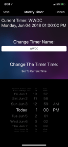
Added a new screen: Modifications. Now modifications are done in it’s own view that will slide in. It will display the name and the current target time of your timer and allow you to change it.
The timer screen has been redesigned. It now has larger text and will allow you to see the maximum amount of time remaining on the target timer
iPad:
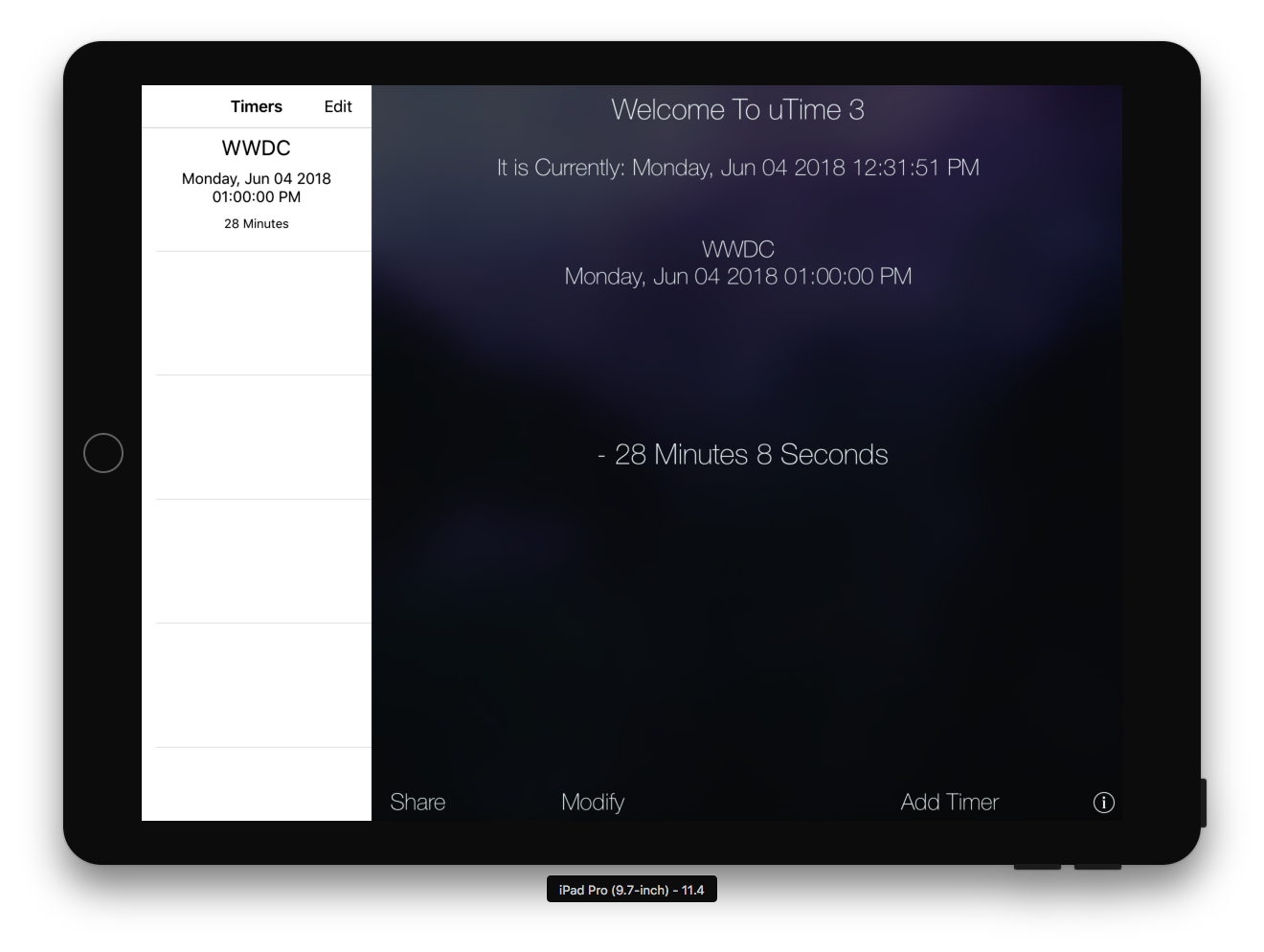
Home screen: The entire home screen has been redone. There is now the list of all your timers on the side bar along with the maximum amount of time remaining.
Modification Screen: Instead of presenting an entire screen a popup view will appear and you can modify the timer and save just by dismissing the controller (by tapping anywhere on screen). The size of the popup does not cover the current timer information so you know what you are modifying.
Web Support Is Now In It’s Own View Instead Of A Popup In The Info View
Both:
Notifications: Instead of a popup alert displaying when the timer fire date is finished a generic iOS banner will appear.
Added the ability to share the timer with various apps using share sheet. This will share the name of the timer and the maximum amount of time there is left.
Changed the background images
Support now opens in a WebKit view meaning there is a progress bar to show you the accurate loading % of the webpage.
Swift: The entire app was rewritten in swift which is why it took so long.
iOS 11: Due to the nature of the app and the newer API’s at the moment uTime 3 is iOS 11+ only.
Even though uTime 3 is 11+ only iOS 10 and below users may still download uTime 2 from the App Store.
uTime 3 is massive for iOS and I hope all of you enjoy it. As always updates will be coming throughout and due to how I set up uTime 3 they will be coming much quicker!
With all of the excitement of WWDC settling I think it is a good time to show off a project that has been about a year in the making: uTime 3 for iOS.
uTime 3 for iOS took a long time because I had to completely rewrite the entire application because of how broken uTime 2 was at the end of it’s development cycle.
The result is a uTime with much more features, much less usage on system resources, and still a fantastic app for counting down to (or from) your next date.
As seen from the screenshot above the iPad version has taken heavy inspiration from the macOS version of uTime 3 and has the timer section embedded into the homescreen.
Along with that notifications have been completely redone: Instead of annoying popups throughout the app a simple banner alert will appear to show the timer has run out of time. Along with this of course timers with an older time than the current date will not fire.
On the homescreen with timers that are being counted down a minus (-) sign will be in front of the time remaining. For timers counting forward because the date has always passed a plus (+) sign will appear.
You are now also able to share your timer with any of your share sheet apps simply by pressing share. It will popup with the name of the timer along with the maximum time remaining.
Along with all of this the way to modify timers has been redone. On the iPhone now there is a completely new view that will appear giving you information on the timer you are modifying and the same ability to modify the timer as you please as before. With the iPad this is presented as a popover view so you can still see the homscreen and information about the timer you are editing:
uTime 3 for iOS Modification Screen (iPhone)
With all of these updates and being rewritten the app should run more smoothly than ever before and bring a better user experience than ever before.
With uTime 3 some things have been removed: Sorting timers by date have been removed due to the fact it did not work well syncing between devices. This feature will be returning in a future update. Also uTime today widget has been disabled because for some reason when I rewrote the app, Apple blockaded my access to iCloud in the today section so I have to rethink how that is done as well. This will also be returning in a future update.
There are a lot of things to look forward too especially with the addition of Siri shortcuts for app developers. I will be hard at work providing updates not only to uTime but a variety of uApps applications to get them up to date.
uTime 3 will be live on the App Store this week and I hope everyone enjoys this huge update.
After being somewhat absent for a lot of the Summer Season (in terms of being a college student anyways) I have pushed a small update to uTime. This update adds support for Apple’s new iPad Pro 10.5 inch. Within the update is also a fix for the “Today” widget that hasn’t been working for a few versions (sorry)!
While I’m not going to share details on what there is a lot of things in the pipeline coming. Just keep watching for it!
Facebook is one of the worlds largest social networks and has the most downloaded iOS app of all time. The app has been slow and unusable and it might come to an end with the newest update. Facebook ditched HTML 5 in it’s iOS app and the result of that is a fast and improved app.
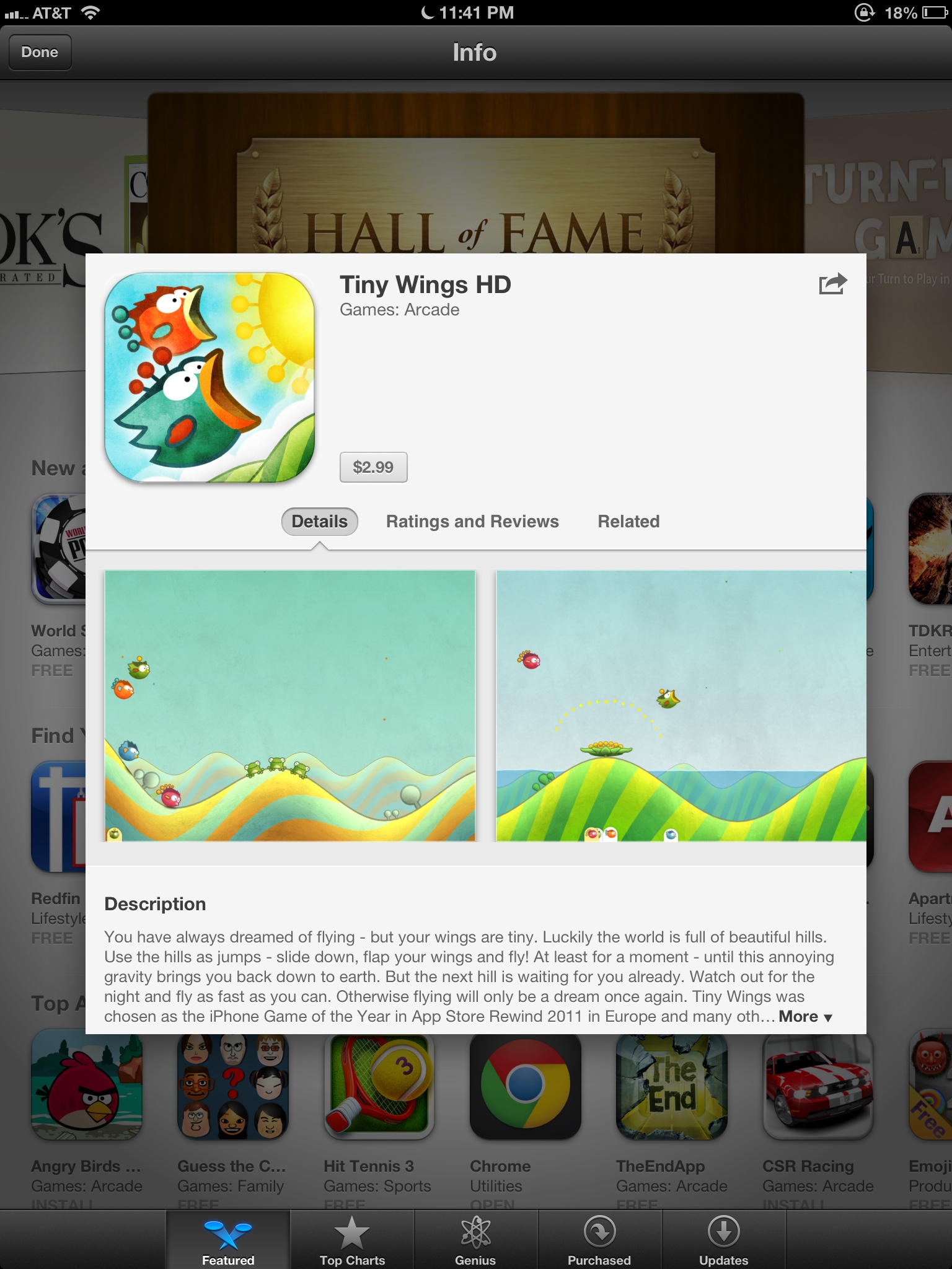
Tiny wings 2 has hit and so has the iPad app! Unfortunately it is a separate app and is $3 but it looks great with the retina iPad and has multiplayer on the same iPad. Hit up the download link!
[Tiny Wings – $3]
Tiny wings 2.0 is now available to download in the App Store! The update includes 15 new hand crafted levels and a new game mode called “Flight School.” The game is free if you already paid for Tiny Wings 1.0 and is available to download now! Link Below!
Remember when Facebook Bought Instagram? Many users ditched and some stayed. Actually I have been getting into it a little more because I like how I can share to all the major networks at once (facebook and Twitter). Facebook has today introduced it’s own instagram app called “Facebook Camera” and to be honest… It’s actually not as bad as you would expect. So let’s go in depth into the newest app from the Social Network giant!
First thing’s first is there really is no reason for this app. At all. They could have easily put all the features inside the Facebook App itself, and I don’t see why they don’t! Actually ALL of the Facebook apps could be integrated into 1 app! With that being set in let’s look at the good the bad and the ugly.
The Good
There is a lot of thing’s I like about this app. However some of it should have been basic for the Facebook app in general and not need a separate app. Actually again all of the apps should just be integrated.
I really like the ability to upload multiple photos. I am not a big photo uploader to facebook but when I go on vacation and snap photos I want to upload them in a bunch not upload 1 at a time! Thankfully they have solved this problem! All you need to do is view a photo and press the little checkmark in the top right! Do that for multiple photos and then press the Compose button on the bottom right. You can also bring up the composer and press the plus for individual ones.
I will be completely honest in this. The effects are not nearly as good as the ones found in Instagram. However they will do. You have to add the effects individually for every photo you want to upload which makes sense. However you can not use blur effects or brightness effects but they might be saving this for another update.
As you can see the effects are similar to that of instagram minus the blur effects and brightness. As you can see from the side by side. Honestly thats the only good thing’s that I can think of right now.
The Bad
There is a ton of thing’s wrong with this app. Well not wrong just annoying little which will probably be fixed in a future generation of this app. One of the thing’s that annoys me the most is that you cannot choose what Album your photo’s will go to. It makes sense to allow people to upload photo’s to an album of there choosing to some but not to the maker(s) of this App. All your photo’s will upload to the Mobile Uploads section of your facebook.
Again it doesn’t make sense to me at all why they didn’t integrate this into the main facebook App which is one of the bad. Here is a note to developers: Not every feature has to have a separate app!
Blur effects are missing from the app and the effects don’t seem to really… Stand out as much as they did with instagram. Also there isn’t borders for it yet. If you think it is because of the sunlight in the image then check this one out.
The Smaller one is the instagram. I don’t know why it is so small. Sorry.
Conclusion
The app is fine. It works if you want it to. However it will never be able to replace the full instagram because it only shares to facebook. Right now it doesn’t even come close because it is missing some of the effects in instagram and basic functions that are in the Facebook mobile app. I don’t see this as an instagram killer… Only a want to be. I have included a video for you to watch to know more. However Facebook has a lot to learn from Instagram… They should use it to their advantage that they own it…
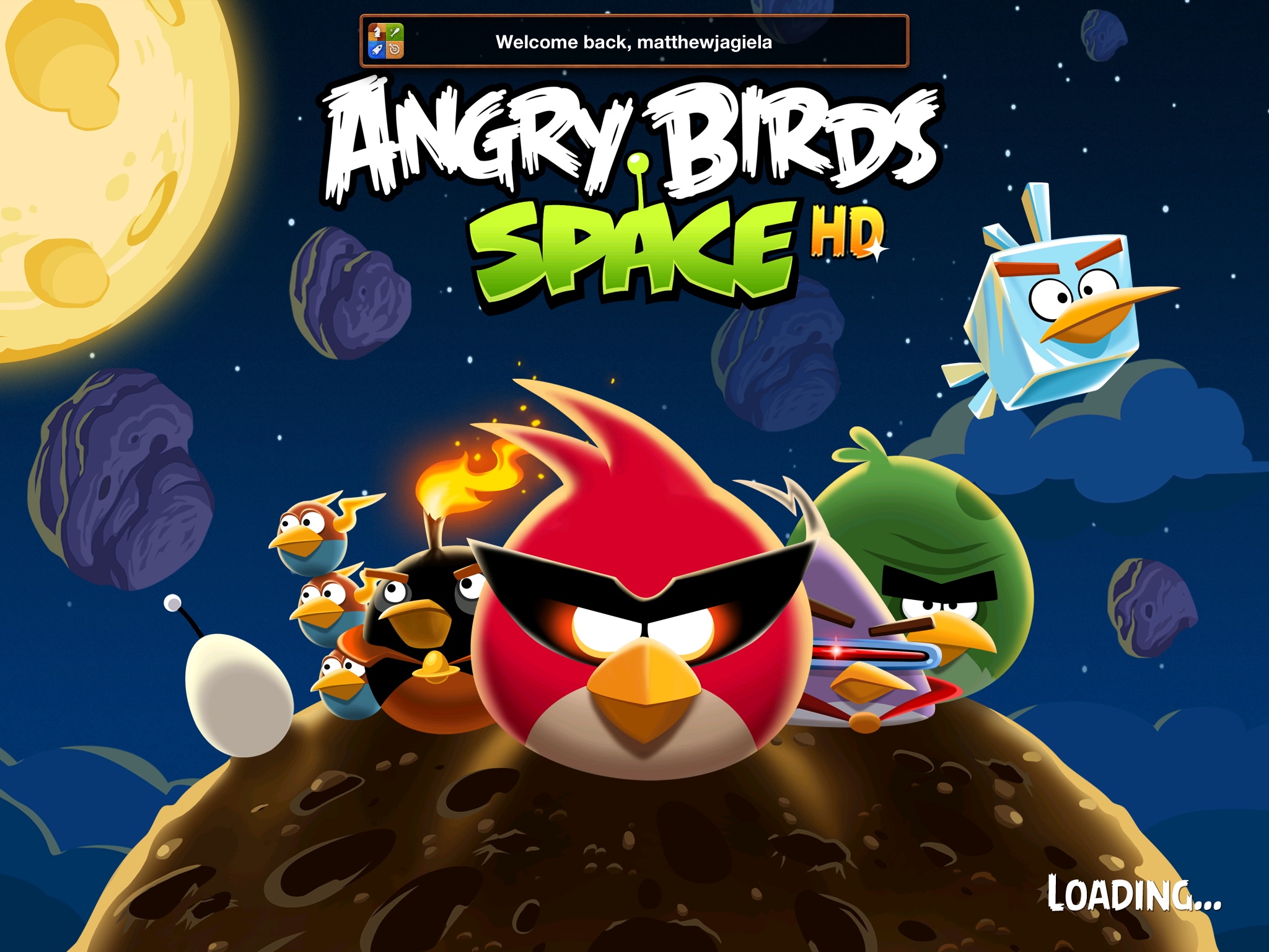
Angry birds space was released last week and just like every other Angry Birds game it has risen to the top of the App store. However how great is the newest game? You might not like it just a fair warning.
Gameplay
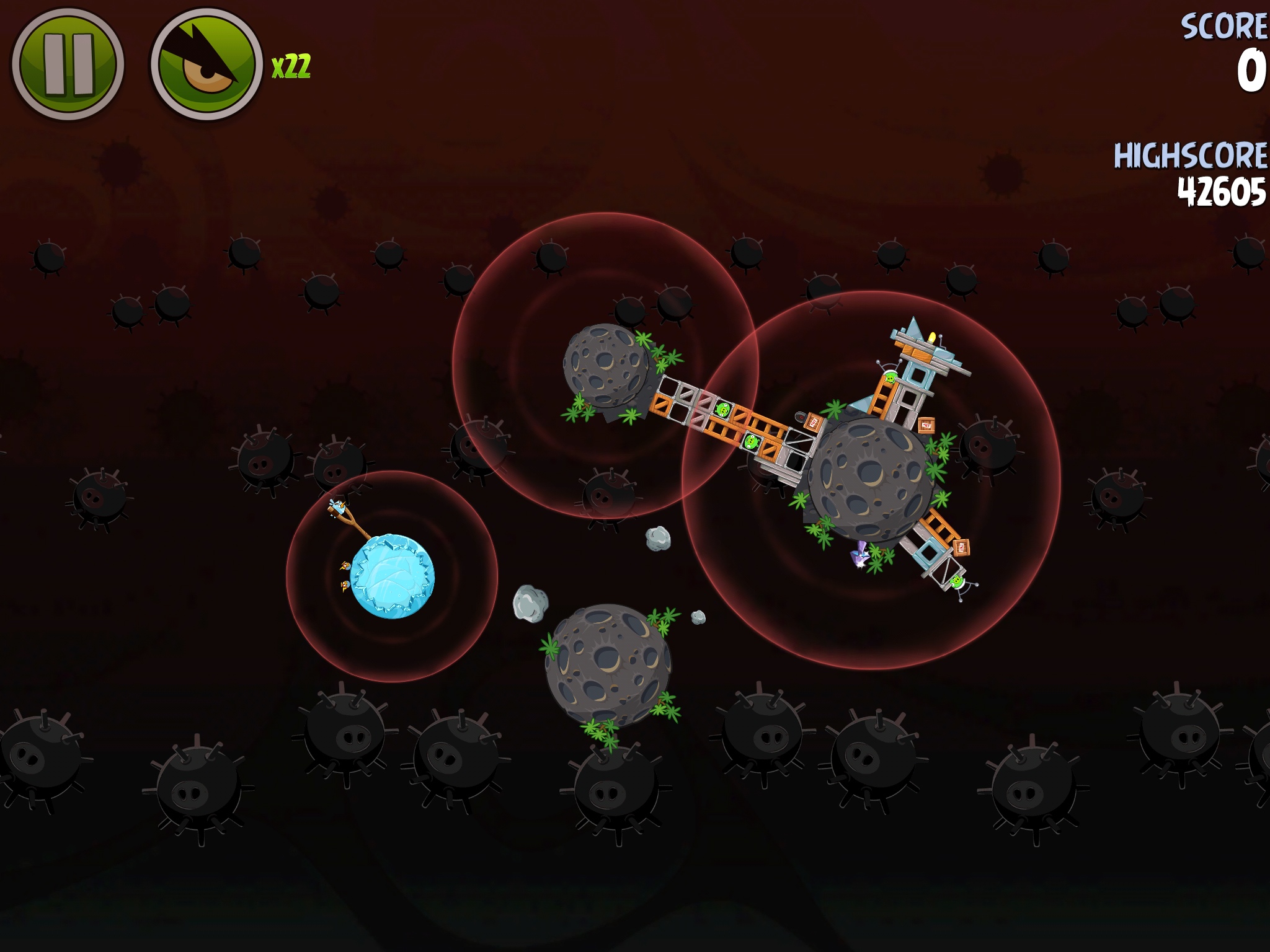
The gameplay of this game is great. It is less challenging than the other Angry Birds games in my opinion. You have to deal with gravity fields and floating rocks in outer space to get through the levels. You even get some new birds that would have been more useful in the other games than this one. The gameplay is great but again sort of simple and the birds are basic modifications of the old birds.
The Good
The good thing is Angry Birds space will keep you entertained for a while anyways but I will get to that later. The levels are a little more challenging with the gravitational pull. I like the new birds for the space theme too.
The Bad
The thing that saddens me the most with this installment is that I see more bad than good with it. The birds are the same thing just with one variation of the yellow speed bird which is now a purple speed that has aim. The only new bird I can see is the ice bird turning blocks into ice so you can destroy them.
So much payed content. You payed for the game right? Wrong! You payed for maybe about half of the game. You get 2 sets of levels and then you need to pay extra for more sets of levels. Rivio do you really need the money cause I refuse to pay for more levels.
Conclusion
It seems Angry Birds has plummeted into a way just to make some more money for the company and the people who created it. I honestly don’t love it. It is too obsessed with getting you to spend more and more without offering anything new. It is fun for a couple of hours until you have to pay for the extra levels…. I don’t say it is a must have because it is the same as every other Angry Birds Game.